Altenew July 2023 Challenge

Altenew July 2023 Challenge


I was so excited by the Altenew July 2023 challenge because it featured the hydrangea color palette of blues and purples (which I love, in case that surprises anyone lol).

I’ve been creating cards in bits and pieces as my full time job has taken up a lot of time and energy, but I’ve been trying to dedicate at least 30 minutes a day to making cards and it’s so satisfying watching projects come to life! I’m sure many of you understand being in a creative slump/lack of time. Which is sad because it provides me a lot of peace and joy, so I’m doing my best to prioritize it more.

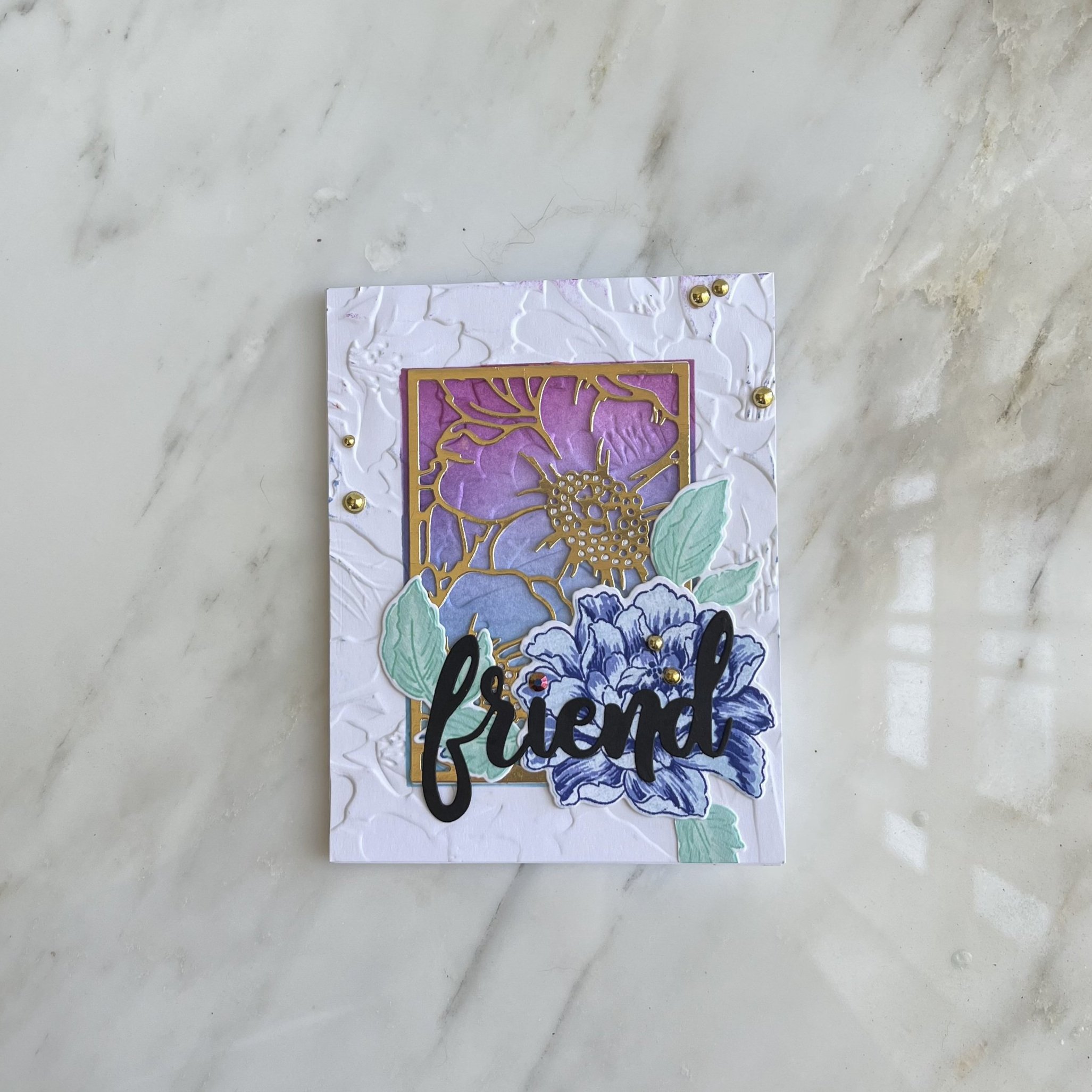
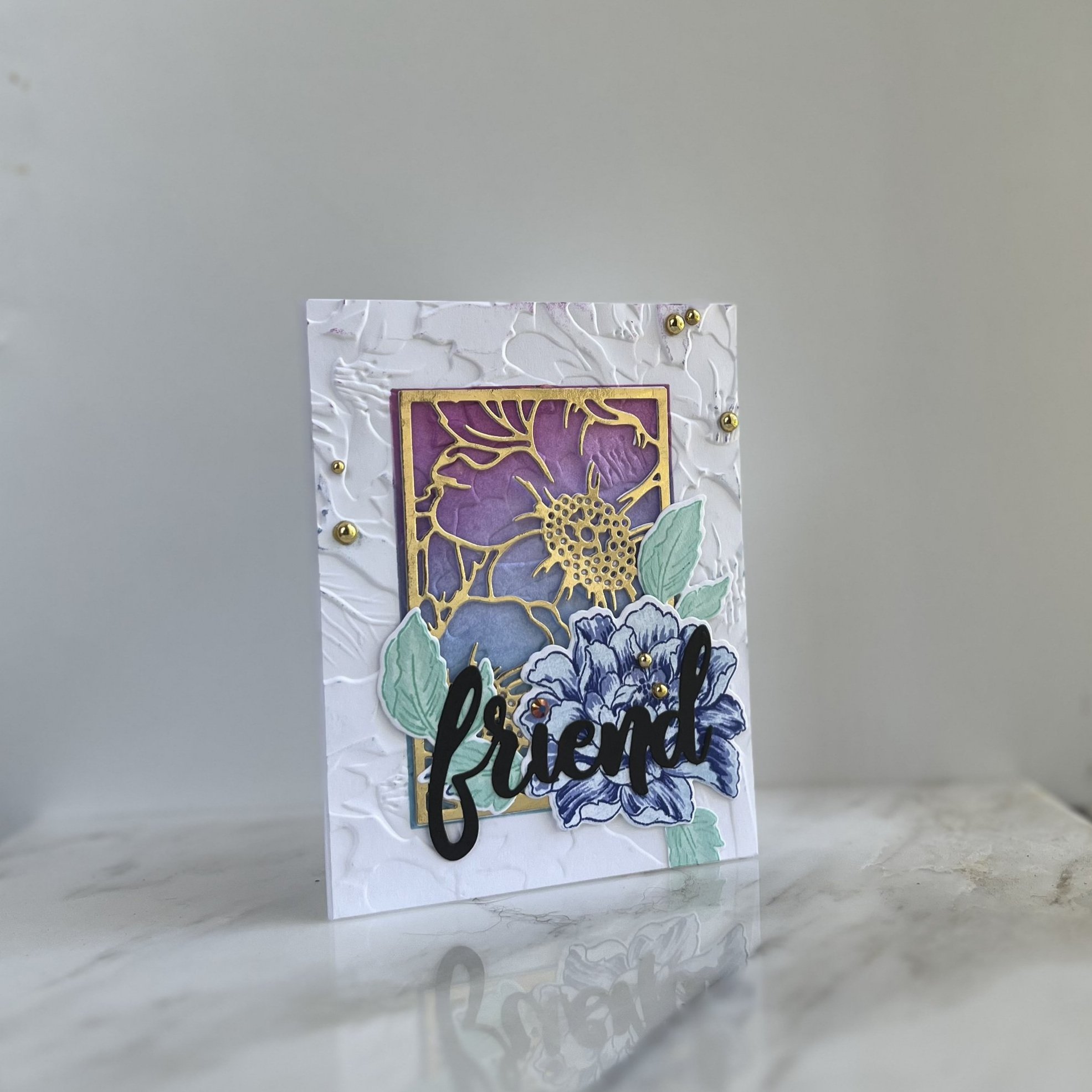
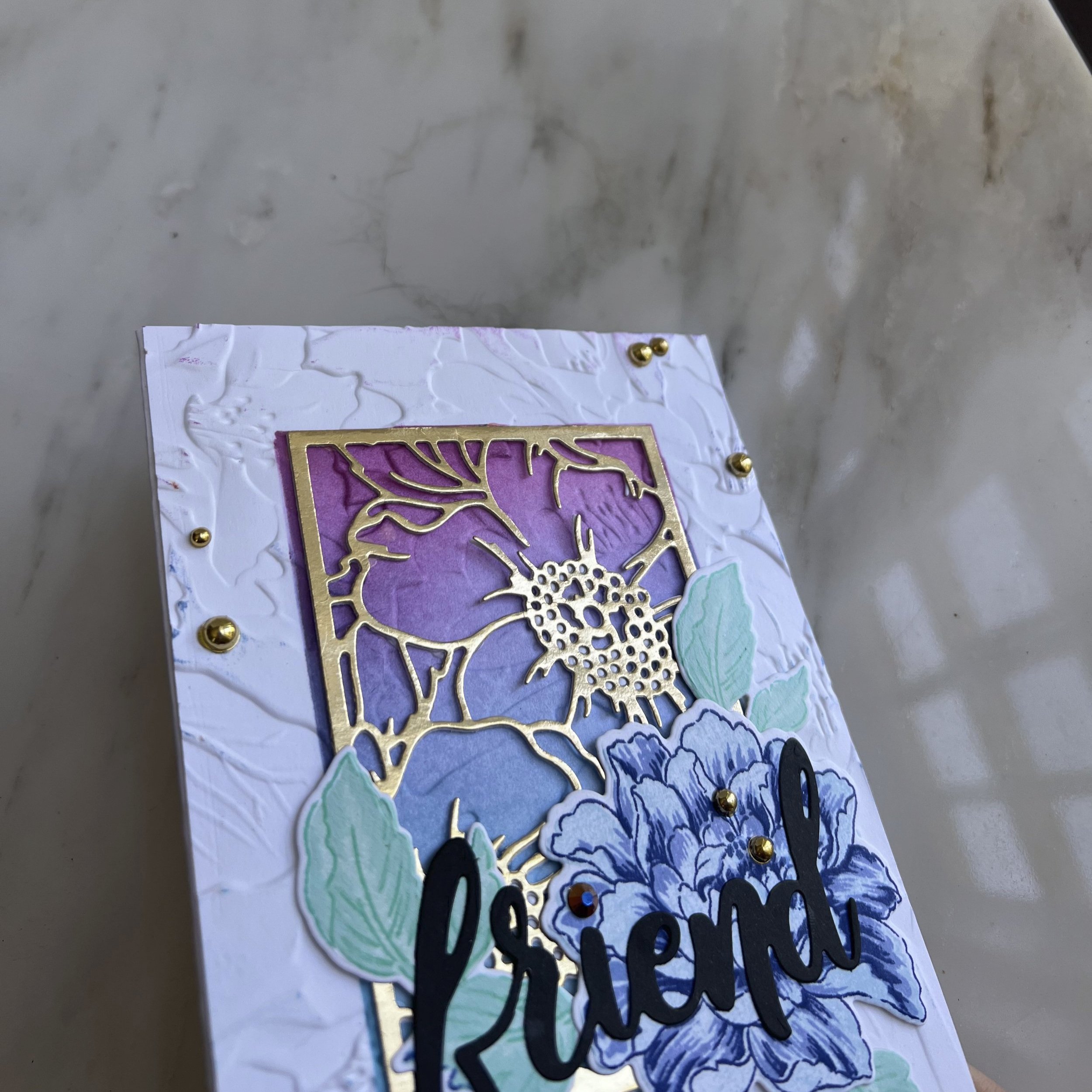
I actually struggled with making my card align with my vision/rough sketch for the card. I wanted a lot of layers and dimension but none of my original ideas seemed to be creating the effect I wanted. After a lot of die cutting and layering, I realized I wanted to try my new 3D embossing folder from Altenew. That ended up being the background dimension I was looking for, along with the layered die cutting, layered stamping, and ink blending and finally created the cohesive look I was going for (previous versions did not look cohesive to me lol).

To make this card, I did the following:

  1. Masked off a rectangle in the center of a 110lb Neenah card stock panel measuring 4 1/4 x 5 1/2.

  2. Ink blended a gradient of purple, periwinkle blue and sea blue with a moderate hand. Removed mask.

  3. Ran this panel through my die cutting machine with the 3D embossing folder “upside down” so that the image would indent inward on my ink blending.

  4. Put the mask back on over my ink blending, and did the same ink blending on the “raised” areas so that color did not go into the indented flowers/leaves. This gives us some color variation and dimension in our ink blending. Removed mask.

  5. Die cut the top layer of the layering blossoms die set once out of white card stock and once out of gold foil card stock. I glued these together with tim holtz matte mixed media glue. I then glued our stacked die cut in the center of our inked area, so there was a thin frame of ink blending around the edge.

  6. On a separate piece of 110lb Neenah solar white card stock, I stamped all the layers of the layering flower in three shades of blue and three shades of teal. I stamped the outline portion in the darkest colors so there wasn’t a harsh black line as that wasn’t the vibe I wanted for the card. (It also helps our sentiment stand out more).

  7. I then die cut out the flower and two sets of leaves and arranged them on the bottom right corner of our gold flower outline.

  8. I then die cut the word “friend” from black card stock and glued it over our flower. It gives a beautiful dramatic look as it’s the only black color on the whole card of soft colors.

  9. I realized that my rectangle mask was not entirely clean when I did ink blending (oops) and so i had a few spots of ink on my white background. I couldn’t find my paper sander (perfect for stuff like this!) so I put some round gold gems in various places (and over my ink mistake). It doesn’t look perfect but I think it looks beautiful nonetheless!

  10. And with that our card is done! (after gluing it on a card base). I really loved this challenge and hope you can find some inspiration from my card! This was definitely a card I’m glad I didn’t give up on.

I will link my supplies below. Let me know if you have any questions or let me know what your favorite color palette is for a card! Thanks so much for stopping by, I hope you have a great day.


Layered stamping: Whether you have one ink color or three!

Layered stamping: whether you have one ink color or three!

Hi friends!

It’s been almost a year and a half since COVID-19 has taken over our lives. I know it’s been such a hard time for everyone in different ways. I tried making cards every day for the first few months of the pandemic, which was great for my mental health. But the pandemic made my job more intense, more stressful and I ended up getting creative burnout and just not having time to do what I loved. It sucked. I’m guessing many of you felt the same!

We went through stressful job stuff, family illness, family death and everything in between. Luckily we had small moments of joy when we could. We also had a huge bright spot: my boyfriend proposed to me! I have always emotionally felt engaged to him but getting to plan out our wedding for 2022 has been such a joy. And it is exactly one year from today! We hope COVID-19 has died down, and it’s safe to travel by then! We can’t wait to see all our friends and family. Anyways, I have been following all the amazing artists and card makers all this time, and I’m feeling inspired to create again. Okay, my personal bit is over now haha. Now onto the cards!

I got this floral layering stamp set from Concord and 9th and I was immediately so exited. But I wanted to experiment with different types of ink for layering. I will have four cards that showcase the set with many different shades of ink and then just using one ink for each step.

I thought this first card was perfect describing my feeling about my engagement! My fiancé is definitely the best person ever (in my personal opinion). I have to say I am obsessed with this sentiment stamp set from Concord and 9th. Like - how can you go wrong with a classic bold font and fun, meaningful sentiments??

So this card is using 3 different inks, from light to dark. All the inks I am using today are from Altenew. I really wanted a card with a letterpress vintage look. Even though we don’t have the dimension of letterpress, I think we have such a classic gorgeous look. I loved it so much I created four cards with the same design.

  • Using my Misti, I stamped the flower first with the three layers, then stamped my leaves and the little vine at the same time.

  • I added the large sentiment first from the Big On You Stamp Set with altenew obsidian ink.

  • I then lined up my smaller sentiment right below. I lined up my words so they overlapped a little with the image which I think is really fun.

My next card is one of my favorites - and it only requires one color each for each part of the little bouquet we made. (Is it a bouquet? A little floral scene? Meh, you get it, right?).

So the same design process but for each additional layer, I stamped the base color (which was the lightest, Mountain Mist) one more time.

  • Meaning, first layer of the flower I stamped once. Second layer of the flower, I stamped twice. Third layer, I stamped three times. If you’d like a more dramatic effect, you can stamp even more times. But I love the subtle, elegant look of the one-ink look.

  • l repeated the same process for the leaves and the fine. And our bold sentiment really stands out even more!

Our third card uses the same technique but works if you have multiple shades but they’re not darker or lighter. You can use the same double/triple stamping technique with other inks even if you don’t have the light-medium-dark combo. This gives you a more varied look and brings more tones into your flower.

I adore this sentiment!

I adore this sentiment!

Our last card is the same as the first card - using three separate inks but with blue. You can see it’s much more vibrant than our one-ink blue flower. But our one-ink blue flower is much more pastel and delicate, and gives us a beautiful look. So you don’t have to worry about layered stamping if you don’t have a lot of inks!

Also I love these cards so much as is I didn’t add ANY embellishments. I’m so proud of myself haha. I literally only used stamps and ink for these cards.

Bonus photo of my cat Toast supervising my art process and judging the finished cards. :)

thank you so much for being here - it’s so great to be creating again! Tell me - which one is your favorite card? What’s your favorite process for stamp layering? Leave any questions or comments!

Supplies

(please note, none of these links are affiliate at this time! I was not given any of these products nor asked to make this post)

Concord and 9th Painted Peony Stamp

Concord and 9th Big on You Sentiment Set

Altenew Pink Ink Set

Altenew Blue Ink Set

Altenew Green Ink Set

Altenew Jet Black Ink

MISTI 2.0

Neenah Cardstock 110lb

Die Spotlighting on Clean Card Designs


USING TWO DIES AS THE FOCAL POINT AND THE FRAME

Welcome! Thanks so much for joining me here.

I’m revamping my blog with a post about creating striking but clean and simple cards. The main products in my cards are from Hero Arts, and I will list all of the products in the bottom of the page. I also used distress inks and alcohol inks to add some color to these cards.

I picked one die to be the focal point for my cards and highlight it in a variety of ways. You can use any die for this, but it works best if it is not a symmetrical shape, and the more intricate the more visual interest you can create. Your secondary die to use for your frame die, is ideally symmetrical and less intricate than your focal die. From here on out, the die we using as the focus will be called the focal die and those we are using to frame it, is called the frame die. My focal die is this butterfly from Hero Arts.

CARD ONE: ALCOHOL INK PANEL AS THE FRAME DIE

Photo+May+26%2C+1+23+54+PM.jpg

The easiest way to frame your focal point die, is with a vibrant colorful panel, cut smaller than your card front. and ideally, slightly smaller than your focal die in one dimension (e.g. skinnier or shorter than the die). This is the easiest way because it does not require a die to be the frame.

I cut down an alcohol ink panel I had already created to be slightly narrower than the wings of my butterfly. This helps the butterfly have some movement and look like it is flying off of the panel. And because my background is so vibrant, I can keep my butterfly in a neutral color, and ideally much paler than my background. I decided to double layer all of my butterflies to create more movement and dimension on these simple cards, so I chose white and vellum layers.

Photo May 26, 1 16 04 PM.jpg

I added white splatter and white paint to make my background look like a galaxy or a night sky. The white butterfly looks ethereal, especially with the vellum and the bit of sparkle I added to vellum wings. I added one white gem to the butterfly to help emphasize the focal point. I added my black stamped sentiment in StazOn ink because I wanted it on my alcohol ink panel. I allowed this to dry for about 5 minutes before touching it. I glued the panel onto my card base and this one is done!

Photo May 26, 1 15 41 PM.jpg

CARD TWO: FOCAL POINT HAS THE ALCOHOL INK

Photo May 26, 1 13 02 PM.jpg

Using the same alcohol ink panel I got my background from, I die cut my butterfly. To offset this colorful focal point, i die cut a white frame die for the contrast. I love the look of white dies on white card stock but i wanted to make sure the white die didn’t blend in too much. So I splattered some gold watercolor on the background, and then outlined part of my die with a thin black pen. This gives some definition but doesn’t overwhelm our focal point.

Photo May 26, 1 13 25 PM.jpg

I added a dark rhinestone to the center of the butterfly, and then added a small sentiment in the bottom right corner. And this card is done!


CARD THREE & FOUR: ALCOHOL INK FRAME DIE

Photo May 26, 1 22 39 PM.jpg

I made two new alcohol ink panels with different colors red & pink and green & teal. I then used these to die cut my frame dies. One is a full wreath and the other is two swags that I joined together to form a large wreath. These two are from a fall My Monthly Hero kit for Thanksgiving, but the wreaths work for all seasons.

Photo May 26, 1 27 39 PM.jpg

I kept my butterflies neutral as my frame dies are colorful, but I wanted them to have a little more sparkle, so I die cut my butterfly out of glitter paper. For my green wreath, I die cut my focal butterfly out of gray glitter paper, and for my pink wreath, I die cut out of white glitter paper.

Photo May 26, 1 16 49 PM.jpg

I backed the gray glitter butterfly with a white butterfly for dimension. I splattered gold watercolor on my green wreath and then added my layered butterfly to my card panel. I put my white glitter butterfly on a black butterfly. I shifted slightly the butterflies so the black butterfly acts a shadow and an accent. This will help it stand out from our white card panel.

Photo May 26, 1 17 36 PM.jpg

I added a few gems to each card and a simple black stamped sentiment, and our cards are done!


CARD FIVE & SIX: TWO CARDS MADE FROM RAINBOW WATERCOLOR

Photo May 26, 1 13 53 PM.jpg

These two cards are made using pieces from one rainbow watercolor panel. I created a horizontal blend of rainbow colors with watercolor and let it dry. I then die cut the butterfly from the exact center of the rainbow part of the panel (or as exact as I could eyeball it lol). I wanted to make sure the entire butterfly contained at least some of every color.

Photo May 26, 1 28 28 PM.jpg

I then cut down my rainbow panel so that it would a large white trim on a card front. I die cut two butterflies from white and vellum card stock and layered those together. I then fit my layered butterfly into the watercolor panel on my card front. I added a few spritz of glitter to help the background sparkle (because why not, right?). I stamped my sentiment in the bottom center, added a few white gems, and this card is complete!

Photo May 26, 1 14 24 PM.jpg

For my other card, I die cut a white wreath using that same wreath die, and glued it to the front of a white card panel, for a nice white on white effect. Then I layered my rainbow butterfly with a black butterfly, but shifted the alignment slightly so it looks like our rainbow has a shadow, and also some great contrast to its vibrant colors. I then placed this layered butterfly onto the white wreath.

Photo May 26, 1 18 16 PM.jpg

And to be honest with you, I really like this card as is, with no sentiment. I’m afraid to put anything on it. Please let me know if you have an opinion or suggestion in the comments!

Photo May 26, 1 18 01 PM.jpg

And these two cards are complete! (I think).


CARD SEVEN: STENCILING WITH DIE CUT SCRAPS

This last card is a little different than the others, but still fits in nicely with our clean, simple and bright cards. I die cut our black butterfly shadows from one piece of card stock, and really liked how all the openings were arranged. So I decided to use my scrap piece as a stencil.

Photo May 26, 1 14 50 PM.jpg

Stenciling with card stock is harder than with a stencil because the paper can be flimsy, especially with intricate areas, so I was a little worried about where the body of the butterfly was cut out. So, after taping my card stock down like I would with any stencil, I made sure to only push my ink in one direction on each part of the butterfly, and twist outward to make sure not to move the paper. This would be even more helpful with those small blending brushes but I do not have mine yet, so I used my regular ink blending tools very carefully.

Photo May 26, 1 30 56 PM.jpg

After I blended my five colors onto my makeshift stencil, I splattered some water and glitter I mixed together to add some pattern to my butterflies. I then placed my last black butterfly die cut onto the center butterfly, and it ends up looking like almost a rainbow monarch, I love it.

For the finishing touch, I just added a few white gems and a small black sentiment in the bottom right, and this card is also complete!

Photo+May+26%2C+1+15+09+PM.jpg

Thanks so much for joining me today, and I hope you give this card design a try! If you do try it out, please tag me, I would love to see it! @periwinklestudio

Bonus photo of my kitten Toast supervising my cardmaking:

Photo+May+26%2C+1+05+19+PM.jpg

SUPPLIES

*Please note, this blog post was not sponsored by Hero Arts in any way (I will tell you if a blog post is part of a hop or sponsored), and none of these links are affiliate links. They’re just here for your convenience. :)

  1. Hero Arts Monarch Butterfly Fancy Die

  2. Hero Arts You Are Loved Stamped Set (all sentiments on my cards today are from this stamp set)

  3. Hero Arts Floral Border with Frame Fancy Die

  4. The wreaths I used are from an old MMH Kit, but here is another beautiful wreath you could use: Hero Arts Branch Wreath Fancy Die

  5. Concord and 9th Neutral Glitter Card Stock

Please leave me a comment below letting me know which card is your favorite! Or ask my any questions!

Sending thoughtful cards is so important, especially right now. Stay healthy, stay safe.

Love,

Meghan


Neat and Tangled Guest Designer for November - Coupon Code & Sneak!

Neat and Tangled Guest Designer for November - Coupon Code & Sneak!

I am so excited to announce that I am a guest designer for Neat & Tangled this month! I will be on their blog every Friday this month. For my first card, I decided to go with a seasonal winter theme as we head into November.

Make sure to head over there and read more about how I made my card and more photos! Also, I have a discount code for you!!

November 2 photo 4.jpg
Neat and Tangled Guest Designer Badge.jpg

Thanks so much for stopping by and make sure to head to the Neat & Tangled blog!

xoxo Meghan

ABNH September Challenge: Monochromatic

ABNH September Challenge: Monochromatic


Monochromatic ABNH Photo 1.jpg

Happy Saturday my friends! I hope you all have a lovely start to your weekend today. This month’s theme at a Blog Named Hero is monochromatic. My ideal colors to use for this would be like aquas and teals, periwinkles and navies and blushes and corals. But I decided to try and push myself a bit outside of my comfort zone and use some neutrals for the monochromatic card.

I started with Kraft cardstock, and used the Besties Stamp and Cut with varying shades of brown. I started with the round stump and used a pale brown ink, and used a dark brown with the leafy twigs, and then the darkest brown for the smallest leaves to fill in my background. This helps give contrast to my background without being too busy.

September ABNH Challenge Photo 2.jpg

I then did some ink blending with gold and copper metallic ink on the bottom third of the panel. This lightened the stamping a little and added some subtle shimmer to the card. Over the lighter part of the panel, I die cut the word “love” from the Love Stamp and Cut set from gold for my focal point.

After I stamped the sentiment “U + ME” under the love, I thought about adding some gems or sequins, but I actually really liked the subtly of sparkle and the earth tones by itself. I stamped our sentiment in black because I thought brown would get lost in our background. Otherwise this is an all brown card! Whew. And it actually looks super classy!

September ABNH Challenge Photo 3.jpg

I can’t wait to see what you do with this challenge, what a great one! Thanks so much for stopping by!


xoxo

ABNH signature.jpg


ABNH August Challenge: Sparkle and Shine

ABNH August Challenge: Sparkle and Shine!

Good morning! Hope you're having a great weekend! 

Sparkle and Shine photo 1.jpg

Today marks the beginning of our next challenge, Sparkle and Shine - and as many of you know, those two things are my bread and butter (Along with flowers and anything watercolor or alcohol ink). For my cards today I wanted to use something that had both sparkle and shine: sparkle embossing powder. The sparkles in it obviously make it sparkly, and the heated powder gives it that shine. It also gives things dimension, which is just another cool effect.

sparkle and shine photo 2.jpg

I'll be using some older stamps and dies today, because it's fun to break out our older supplies sometimes! For my first card, I did some distress ink blending with some greens and teals and then die cut the panel with the Hero Arts Circle Confetti Die. I then die cut that panel with a large heart from the Hero Arts Infinity Heart Die Set. Once I had my bubbly heart, I smooshed Versmark embossing ink all over it and added clear sparkle embossing powder to it three times, to give it that texture and dimension, as well as sparkle and shine. 

sparkle and shine photo 3.jpg

Then I did some distress ink blending in a rainbow of colors, and die cut a swag of it using last year's fall MMH kit. I cut the spring a part so I had a couple pieces to place where I wanted around and behind the heart. Because our large heart had so much shine and texture, I kept the card simple and just added a small sentiment and a few gems in the white space. This gives a clean, white but colorful card. 

sparkle and shine photo 4.jpg

For my second card, using that same rainbow distress-inked panel, I die cut out the Eiffel tower using the Hero Arts Paper Layering Eiffel Die. This die already has a lot of cut in texture to it, so I only added two layers of embossing instead of three. Also, I didn't want the multitude of colors to get lost beneath all the sparkles (with out heart, since we only used one color family, I didn't worry about that).. I then die cut out a floral window frame with butterflies on it from Kraft cardstock for a good neutral background. I trimmed it down for some white, and added my window die panel and then our magical looking Eiffel tower for an amazing pop of color and shine. I found a butterfly sentiment from the Layering Butterfly Stamp Set, added some white gems and we are done. Our colorful Eiffel tower remains the focal point, and boy does it deserve to be! 

sparkle and shine photo 5.jpg

And there we have our clean and simple cards, with some big sparkly and shine center pieces. I hope this inspired you to pull out your embossing powders, or at least to make everything sparkly and shiny! Can't wait to see what you create!

xoxo

ABNH signature.jpg

ABNH July Challenge: Birthday! Cards Using Background Scraps

Birthday Cards Using Background Scraps!


Hello! Hope you're having a good weekend! This month's challenge for A Blog Named Hero is Birthday! I love to make watercolor and alcohol ink pieces and die cut them or cut them down to use on my cards. I hate throwing away those beautiful colorful scraps, so I keep them and die cut small shapes out of them. Sometimes they're just strips, and I use them as stripes or die cut edges on them to create a new look But today we'll be using pieces that use dies small enough to cut shapes from them and use many of them to create a card. 

July Birthday Challenge photo 1.png

After I made all these alcohol ink and watercolor pieces, I couldn't bear to throw out the pretty scraps - I'm sure many of you know what I'm talking about! So I die cut all of them using various small heart dies from the Hero Arts Nesting Hearts Infinity Die Set. And I'm using them today to create our own heart balloons, and they're pretty multi-colored look will make them great focal points. 

July Birthday Challenge Photo 2.jpg

For the look of confetti in the backgrounds of our balloons, I die cut the Hero Arts Circle Confetti Fancy Die from scrap paper to make my own stencil. You could also use post it tape or something with temporary adhesive, but sometimes I just use scrap paper haha. I put a light blending of Tumbled Glass distress ink blue 2/3 down my card, and a light blending of Squeezed Lemon  distress ink yellow 2/3 down my other card. I did this before I cut apart of my 8 1/2 x 11 paper and this allowed some bit of yellow on my blue panel and a bit of blue on my yellow panel and I love the way that turned out. Then using my makeshift stencil, I put heavy amounts of the same color family to make my confetti. This gives us a nice subtle background that won't distract from our pretty balloons. 

July Birthday Challenge Photo 4.jpg

Then I took 5 hearts of varying sizes and arranged them on my panels and glued them down when I was satisfied with their placement. Using a T-ruler, I drew black lines from my balloons for their strings. I then stamped this sweet sentiment in vivid black at the bottom portion of the panel, from a great stamp set called Color Layering Ice Cream Set. 

I added white gems to my blue panel and yellow gems to my yellow panel for some shines and more confetti. I think if I did these again, I'd put blue gems on my blue panel, the white gems get a little lost to me. And our cards are done! 

July Birthday Challenge Photo 6.jpg
July Birthday Challenge Photo 7.jpg

Thanks so much for stopping by and I hope you have great fun making birthday cards from those pretty scraps you make! And below I have in-process pictures of my cards that are really just an excuse for me to show my new kittens and how much they interfere with my artistic process lol. They are the cutest distractions ever. Meet: Mocha and Toast!

Have a great day and enjoy the kittens! 

ABNH July Kitten 3.jpg
ABNH July Kitten 1.jpg
ABNH July Kitten 2.jpg

xoxo

ABNH signature.jpg

A Blog Named Hero June Challenge: Summertime Fun

ABNH June Challenge: Summertime Fun

Hello again everyone and welcome to another ABNH Challenge! This theme is super fun - Summertime! Summertime can mean so many things - flowers, the tropics, ice cream, the ocean, poolside, sunshine, etc. 

June Challenge Photo 1.jpg

For mine, I decided to do some tropical flowers using an older Hero Arts stamp set that I adore called The Color Layering Hibiscus. For our summer theme I chose some warm vivid yellows, pinks and reds, then some bright teal for our leaves. If you want to get an easy graphic look to your layering stamps, use a crisp black for the last layer - it makes them look modern and bright, and I loved doing this technique on these flowers. 

And for this technique, it doesn't matter quite as much if you get your layers exactly perfect because we're already going for that bold graphic look. If you look closely at my card, you can see I didn't get my layers perfect!

After I diecut my flowers and leaves, I wanted to create a tropical watercolor background with greens and blues. For this, I used one of my new favorite products from Hero Arts, Ombre Reactive Spring Day Ink. You can just smear this as generously or as sparingly as you want, add some water and watch the colors turn to watercolor. It's awesome. I loved it so much, I didn't even add any watercolor touch up to my background. 

Once I had adhered my flowers in a cluster to my background, I added a sentiment from another of my new favorite stamp sets: Peonies. I added some gems and then sprayed it with a shimmer mist for some extra shine, though it's hard to tell in the photos? 

Our card is done and thank you so much for stopping by, and be sure to head over to ABNH to see all the other warm and bright inspiration for this month's challenge, and I can't wait to see what you create! 

xoxo

ABNH signature.jpg

ABNH May Challenge: Watercolor

A Blog Named Hero May Challenge: Watercolor


*If you are looking for the Hero Arts Summer Catalog Blog Hop, please scroll down one post!*

ABNH May Challenge Logo.jpg

Good morning friends and welcome to another challenge! Watercolor is another one of my favorites - it is so beautiful, and also a big unpredictable haha. So if you're feeling overwhelmed or unsure what to do with it, the funnest way to play with watercolor and have no worries is to just play with it and put it on backgrounds, which is what I did for my two cards today. I'm featuring the Good Puns stamp set, which is just the best. 

ABNH May Challenge Photo 1 complete.png

For my first card, I just picked colors I knew would look great together: those classic sunset colors. I put them down in sunset order but let them overlap, and added water to let them mix in new ways. Feel free to experiment with how much layering you do, just know that too much and the colors start to lose definition or become muddled. 

ABNH MAy Challenge Photo 3 complete.jpg

I put the waffles and the hearts in a lined up pattern across my background, and cut it down to leave some white space. I added some black lines in a black pen to add some visual structure to our card, added some jewels and sentiment, and we are done!

ABNH May Challenge Photo 5 complete.jpg

The second card is very similar except that I used a small acrylic block to smoosh distress ink and added lots of water and "stamped" it down in an overlapping pattern. I loved the results of this! For this more organic background, I decided to put my donuts randomly on the background with no fixed pattern and I love the look of this too! I added the same finishing details as the other card, and we are all set! 

ABNH May Challenge Photo 2 complete.jpg

I hope you play with some watercolor this month - whether you are an expert or not! I definitely will be making more. Thanks so much for stopping by!

ABNH May Challenge Photo 4 complete.jpg

xoxo

ABNH signature.jpg


Hero Arts Summer Release Blog Hop

Hero Arts Summer Release Blog Hop

Bloghop_800.jpg

Welcome everyone to the Hero Arts Summer Release Blog Hop! I am so honored and grateful to be a part of it, for the first time ever! There is so much amazingness along the way, so be sure to check out everyone's blogs to get tons of inspiration on the newest products that will be available directly at Hero Arts. Please see at the bottom of this post for a list of the blog hop participants! 

HA Blog Hop Photo 4.jpg

Today I am sharing two cards with two new products! My first one features the new Bandana Bold Prints background die. I wanted to show that it could be used in non-traditional colors, and in a non-traditional way, so I did some watercolor effects by smooshing different distress inks and spraying lightly with water. You want to be sure to spray lightly, since too much can make the color pool and you lose the cool pattern of the Bandana.

HA Blog Hop Photo 5.jpg

I then die cut it using an older product, the Infinity Heart Dies and used the Heart Confetti Background die a white-on-white accent behind our large heart. Using a sentiment from a MMH kit, all I added was a few jewels and some Nuvo Drops around the edge of our heart. And we have created a warm card with a focal point with lots of interest, because we used the bandana background die. 

My next card features the new Color Layering Mountain Lion stamp set, and it creates such a beautiful big cat! And with only three layers too, which are super easy to line up. I blended a twilight sky using distress inks, and sprayed it with water for a starry look. I then stamped the mountain range in black at the bottom of my panel, and added my puma on top, which I hand-cut out.

HA Blog Hop Photo 1.jpg

I die cut a circle using the Infinity Circle Die Set to act as a large rising moon behind our puma, and also to help break up some space on our card. I added my sentiment in the bottom left, and a few jewels and this card is done as well!

HA Blog Hop Photo 2.jpg

A Blog Named Hero April Challenge: Put A Flower On It

A Blog Named Hero April Challenge:

Put A Flower On It

ABNH April Challenge Logo.jpg


Hello Friends! I am so excited to be back with another monthly challenge from ABNH: Put a Flower On It! And I am extra excited because "Put a flower on it" is basically one of my life's themes, and it's my birthday month so it seems super appropriate for me. 

ABNH April Challenge Photo 3.jpg

Today, I'm exploring how to combine just black-and-white outline stamps with colored/colorful stamps for a modern, bold and classy look. The black and white really helps contrast vivid (or pastel!) colors while also filling out the card. 

For my first two cards, I combined colorful die cuts with the black and white to create striking bouquet in the center of the card. I first die cut from white cardstock The Bold Confetti Background die, and cut it down one inch, and put it in the center of the card. This will help give some visual gridlines and put the focus on our flowers. Then I used Archival Black Ink to stamp some outlines of roses onto some alcohol ink pieces I had done. Then, I stamped the same images onto just cardstock. I combined these two together to create two cards with a mixed bouquet. As you can see, this works great with just one focal color or multiple! I added a few colored gems for a bit more color, but otherwise everything is black and white to let the alcohol ink shine!

ABNH April Challenge Photo s5.jpg
ABNH April Challenge Photo s7.jpg
ABNH April Challenge Photo s9.png

For my last card, I used the outline stamp repeatedly on a background for a subtle but busy background to my vibrant alcohol ink flower. I love the bold but classy look you get from the crisp black and white to the big mix of color in the bottom right. I like how my sentiment almost blends into the background but is still easy to read. 

ABNH April Challenge Photo s2.jpg
ABNH April Challenge Photo s1.png

I hope this gave you some inspiration for how to use outline stamps without having to color every single one, and some new color schemes! And more importantly, I hope it inspired you to put a flower on it!! Make sure to stop by the ABNH blog and check out all the other designer's amazing floral cards!


Thanks so much for stopping by, I really appreciate it!

xoxo

ABNH signature.jpg

Products Used:

HERO ARTS:

- Hello Stamp and Cut Set

- Florals Magnolia Stamp and Die Set

- Layered Roses Stamp and Die Set

- Bold Confetti Background Die

OTHER PRODUCTS:

- Tim Holtz Alcohol Ink

- Be Creative 3mm Adhesive

- Ranger Multi Medium Matte

- Archival Black Ink 

- Lucys Cards Jewels


A Blog Named Hero March Challenge Inspiration

A Blog Named Hero March Challenge: Use Your Favorite Hero Arts Product

Welcome friends, I am so excited to be here for my first ever ABNH Challenge! I hope that today I provide you with some inspiration for this month's challenge: Use Your Favorite Hero Arts Product.

March Challenge Logo.jpg

So like many of my fellow designers and I'm sure many of you, picking a favorite Hero Arts product is like trying to pick a favorite movie - almost impossible. So instead of making myself choose from all the gorgeous stamps and dies, I chose, the Hero Arts Unicorn White Pigment Ink - it is a vivid white pigment ink that can be used with almost all of my favorite Hero Arts products. I hope this is might be a reminder that any small product can be used in big ways!

ABNH March Challenge Photo s 1.jpg

For my first card, I used the Unicorn White Pigment Ink to blend with.  On a special, textured paper from a past My Monthly Hero kit, I blended this white ink using the Large Flower Stencil, which made this beautiful subtle background - more subtle than if you used white embossing powder but adds a soft image to your project. 

ABNH March Challenge Photo s 2.jpg

To make this background into a card, I die cut a heart from white card stock and put it in the lower right hand part of my card. This heart comes from the Infinity Heart die set (another favorite of mine!). Then I die cut a partial wreath branch from gold glitter card stock and glued it behind the heart. I only glued parts of the leaves down, to help give the card some more dimension. 

ABNH March Challenge Photo s 3.jpg

For the butterfly, which is from the Color Layering Swallowtail stamp and die set, I used Hero Arts ombre ink pads to give the butterfly even more color. The sentiment is also from that same stamp set. I added a few gems, and this card is complete! 

For my second card, I decided to use this ink for stamping to create a subtle look on a background in a different way. This ink shows up best in stamps with bolder lines or more surface area. If you use it with fine lined stamps, you'll get more of a texture on your card stock rather than a very visible image. 

ABNH March Challenge Photo s 4.jpg

First, I blended three distress inks over card stock a random pattern. We want to be heavy-handed with this, as the brighter the colors, the more visible our white ink will be. I then stamped the background images of a rose and leaves from the Color Layering Rose stamp set with the Unicorn White Pigment Ink. You can see in my background where the color was heaviest, the white showed up the best. I love the subtly and texture this adds to an others bold background. 

ABNH March Challenge Photo s 5.jpg

To finish off this card, I die cut and stamped the top layer of the Color Layering Rose leaves. I added these behind the word "love" which I die cut twice from black card stock. The "Love Stamp & Cut" set has both the "love" die cut and our stamped sentiment. I added some white gems scattered between our background images, and this card is done! 

Thanks so much for stopping by today, and I hope you join us in this challenge, the possibilities are endless!

xoxo

ABNH signature.jpg

Hero Arts Products Used: 

Other Products Used: 

  • Mermaid Lagoon Distress Ink
  • Picked Raspberry Distress Ink
  • Squeezed Lemon Distress Ink
  • Tim Holtz Bright White Watercolor Paper
  • Lucys Cards Jewels
  • Be Creative 3mm Tape
  • Tim Holtz Multi Medium Matte Glue
  • Neenah Solar Crest White 80lb. 

I'm a Designer on a Blog Named Hero!

My Intro Post on A Blog Named Hero

Hello Friends! I'm very excited to share with you that I am a designer for a Blog Named Hero - the official challenge blog of Hero Arts. Right now, I have up on their blog a card I made and a little intro to myself (although many of you already know most of that stuff about me already!). If you want to see more photos of this card and see more of the other designers, you can head on over here! : http://www.ablognamedhero.com/2018/03/meet-design-team-member-meghan-peterson/

ABNH Photo 3.png

Thanks so much for stopping by!


xoxo

Meghan


Essentials by Ellen Gift Card Winner

Essentials by Ellen Gift Card Winner

Hello!

Just popping in to announce the winner of the $50 Ellen Hutson gift card! Thank you for stopping by and all of your lovely comments - they meant so much to me!

And the winner is...

Marianne!

Marianne, please send me your email address so EH can get your gift card to you! You can email me at periwinklestudiodesign@gmail.com. 

Thank you again to everyone! I'll be back soon!

xoxo Meghan

Essentials by Ellen March Release Sneak Peak: Watercolor Stamping and Backgrounds + GIVEAWAY

Essentials by Ellen March Release Sneak Peak Cards:

Watercolor Stamping and Backgrounds + GIVEAWAY

Image 1.jpg


Hello! I am so thrilled to be guest designing for Ellen Hutson, and it was so fun to work with such a unique release -available for purchase on Sunday March 4th. And today I’m going to use most of this release in a technique I adore – creating watercolor looking backgrounds and stamping without actual watercolor. Also make sure to read to the bottom to see how you could win a $50 gift card to Ellen Hutson!

We all love distress ink backgrounds, but with watercolor stamping on top you can create another great look. I picked my color palette and then found the lightest shades of distress inks and blended them on my card stock. For the most watercolor-esque look, blending the colors in random places helps create the look.

Image 2.jpg

As you can see in the photo, my blending is not perfect, which is fine for this technique. Then I took some pretty images from the “So Matcha” stamp set and arranged them into a cluster on my acrylic block. I then took the same colors of distress inks I used on my background and pressed them onto my images, making sure they overlapped. (Tip: when using analogous colors, you can usually just press directly onto your stamps, but if you’re using very different colors, use a small ink blender so you don’t contaminate your ink pads).

Image 3.jpg

Another tip, because these images have just delicate and intricate lines, I don’t add water to blend the colors together. One, because it’ll look blended enough on the fine lines, and two, because if you add water it will easily bleed out and warp the look of the image. This also makes the images stand out a bit more from our background of the exact same colors.

The blended background plus our blended stamped images give this background a faux watercolor look. If you would like to enhance this look, you can drop water droplets from a brush and let them interact with the distress ink.

To finish off this card, I used the “Fortune Cookie” dies to cut one of the fortune cookie shapes out of Kraft cardstock. I then lightly blended some brown ink to the bottom left part for so minimal shading. This die cuts slits in the fortune cookie where you can slip in the fortune. I am obsessed with this idea – you create your own fortunes! And the sentiments for the fortunes are so awesome – they’re perfect so many different kinds of cards. So I picked out the fortune I wanted from the “Good Fortune” stamp set, stamped it onto the die cut white cardstock and slipped it into the slit.

Also, often when I create full backgrounds like this, I like to help give some visual balance to the card by using some horizontal lines to help break up the expanse of the background. For this card, I used three white stripes of cardstock behind my fortune cookie. I then blended some color onto the edges of them – and I’m not 100% if that was the right decision, but there you go haha.

Image 4.jpg
Image 5.jpg

And the card is done!

My second is done using the same technique except with larger and thicker-lined images from the “Rustic Flowers” stamp set, so I used 1 or 2 spritz of water to help blend the color and lighten it a bit, which makes the flowers and leaves blend more into the background for a cohesive look. Don’t spray much more than this though, because the images will start to lose their shape. Again, I used the exact same colors for the background as I did for the images.

When you apply your ink to your stamps, either using the mini distress cubes directly or using a finger dauber, make sure to put your lightest color down first, and put down more than you think you’ll need. The lightest colors, especially yellow, will get mixed and lost very easily. When deciding how much or where I want to put my color on the stamps, I honestly only make sure I have a relatively even amount of each color – I don’t think about placement a ton and it always turns out great!

Image 6.jpg

 I then added those small clusters of flowers from the “So Matcha” stamp set to fill in any gaps, using the same colors of distress inks. I used the same design for this card – the gold strips of paper to break up the background. Gold or silver papers are a great way to add shine/texture without distracting from colors in a card.

Image 7.jpg
Image 8.jpg

My third card uses the same technique, but uses lighter colors for the background and darker shades for the stamped images. I wanted these beautiful bamboo images from the “So Matcha” stamp set to stand out again the green background we created. I also varied my stamping technique – I alternated between spraying the images with a spritz of water and using no water at all. This also helps to create even more faux texture. In this card, my sentiment was my focal point so I used white strips to frame it. The sentiments are from the amazing fortune cookie sentiment stamp set. I added some gold watercolor splatter for fun.

Image 9.jpg
Image 10.jpg

BONUS CARDS: My other two cards are bonus cards because they’re not made with the technique we’ve been using. These are made with actual watercolor backgrounds. This one I used watercolor to create a twilight sky for these pretty lanterns to hang in. I stamped the bamboo lightly in gray so as not to distract from our colorful sky, and added these two cute friends. I added many clear rhinestones in the sky to emulate smaller points of light/lanterns in the sky and added the sentiment right above the girls’ heads.

Image 11.jpg
Image 12.jpg

My last card, I used a portion of a yellow and pink watercolor background as a backdrop to our glittery fortune cookies of varying shades of gold. I framed our focal point with Kraft cardstock stripes for a clean look.

Image 13.jpg

Would you like to win a $50 gift card to Ellen Hutson?? All you have to do is leave a comment on this post by March 8th telling me what your favorite card was, and I will announce the winner March 9th! 

Products I used:

“So Matcha” Stamp Set

“So Matcha” Coordinating Dies

“Fortune Cookies” Dies

“Good Fortune” Stamp Set

“Rustic Botanicals” Stamp Set

Colors I Used: 

Twisted Cintron Distress Ink

Cracked Pistachio Distress Ink

Pine Needles Distress Ink

Peacock Feathers Distress Ink

Tumbled Glass Distress Ink

Salty Ocean Distress Ink

Shaded Lilac Distress Ink

Picked Raspberry Distress Ink

Spun Sugar Distress Ink

Squeezed Lemonade Distress Ink

Thanks so much for stopping by today! Again, it is so awesome to be a part of an Essentials by Ellen release, happy shopping starting March 4th! https://www.ellenhutson.com/this-just-in   

ig-20180226-ebe-release-coming.jpg

Christmas Cards with Non-Holiday Supplies

Christmas Cards with Non-Holiday Supplies

Hello!

I'm back after a month's hiatus! Still working out the scheduling of my blog, and also the holidays and my boyfriend's upcoming finals are taking over a bit!

I wanted to focus today on making holiday/Christmas cards with supplies not designed specifically for the holidays. Christmas stamps and dies are super fun, but sometimes you just don't have the time or money to get new specific supplies, that you can only use a couple months a year. So I wanted to share with you what I look for in my existing supplies for holiday cards, and how I turned them into holiday cards!

Please note that for this post, I have used mainly Altenew stamps, stencils and dies, but you can use any similar supplies. This post was *not* supplied by or requested by Altenew.

These are the basic elements I look for in the supplies I have:

1. potential Christmas patterns: polka dots for snow, stripes & plaid, trees that could create a winter scene, etc.

2. potential Christmas shapes: florals that could be holiday themed, vaguely poinsettia shaped flowers or winter flowers, leaves in general as long as they aren't tropical looking

3. specialty paper: gold and silver, red and green, or even blue for winter scenes

4. any Christmas or winter themed ink colors to color any of our patterns or shapes

5. any embellishments that could be used for snow, berries or holiday decoration (red or green gems, pearls, white embossing powder for snow, etc.).

6. alphabet stamps or dies are super useful for this, because you can spell out anything you want, without having to get Christmas sentiments

For my first card, I combined a leaf cover die, specialty paper, red embellishments and alphabet dies to create my Christmas card.

I did some green watercolor on some watercolor cardstock, and then die cut the leaf cover die from it. I also used it to cut white card stock to layer underneath our green paper to create dimension. I then adhered them both on top of silver glitter card stock for some extra holiday shine. I then flicked water on the watercolor paper to create some spots that could emulate snow.

Then I die cut the letters for "peace" twice, once from gray and once from white. I glued the gray behind the white for a bit of a shadow effect, and then painted the white letters with Wink of Stella for some shimmer. Then below "peace", I added 5 red gems for some extra traditional Christmas colors.

20171202_153458.jpg

For my second card, I found stencils that were generic enough to look like Christmas flowers and used Christmas colored inks to make it obvious they were holiday flowers. This a set of two stencils, with one that adds depth and details to the outline image. I used reds for the flower, and greens for the leaves for traditional Christmas colors. I then added white shimmer watercolor in drops to look like snow. For some extra shine and dimension, I added some pearl Nuvo Drops and some sequins. I then used an alphabet stamp set to say "Merry Christmas" and "Happy Holidays" on another. Sometimes just the right colors and some snow effects are all you need to turn a non-holiday flower into a Christmas card!

20171202_153520 (1).jpg
20171202_153538.jpg

For my last card, this was an experiment for using Nuvo Drops as holly berries. This means they needed to be much bigger than I normally use Nuvo Drops and bundled near each other. For this try, I applied all the different colors of berries at once. However, this meant that some blended together a bit and lost their nice round shape. When I make this card again, I will wait for each set of berries to dry before adding the berries that will be touching the others. But I wanted to show you this card anyway, even though it isn't perfect!

I used this plaid background die for a white on white texture look, and then painted this garland die different greens, and layered it together to create a half-wreath or the leaves to a holly berry. Then I applied the Nuvo Drops as I mentioned before in dark pink and gold. I then die cut letters out of Kraft cardstock to spell "joy". When I re-make this card, I might move the joy closer to the focal point, but I'm not sure yet. But I think this card design has potential!

20171202_153629.jpg

That's it for now! I hope this was inspiring to see what you can do with your regular supplies to turn festive! And of course, you can make tropical Christmas cards by adding white embossing powder to palm trees or have it snowing over the ocean, or whatever your heart desires. I highly recommend alphabet stamps or dies so you can turn any card into any sentiment you want though.

Hope you're all doing well, and sending you love, peace and joy!

xoxo

Meghan


Feature Friday: Concord and 9th Blooms Fill-in Bundle

Feature Friday: Concord and 9th Blooms Fill-in Bundle

Happy Friday Friends!

Today is my last Friday as Guest Designer for Concord and 9th, and I've been so honored to be a part of this! This stamp and die set is one of my favorites, especially because it works so wonderfully for the holidays and all other times of the year. And then of course, it's so smart because there are so many variations you can get with just one stamp set. Let's dive in, yes?

20171101_104120.jpg

My first two cards are a good example of how you can get two cards from one background. I created this background by stamping with mint green ink and then filling in the flowers to look like poinsettias. I added gold nuvo drops for a festive flare and let that dry. I then die cut out the window using the die in the set. From that, I die cut out one of the flowers to use on my second card.

20171101_104031.jpg

For my second card, I used the plaid background, which allows to create detailed plaid backgrounds super easy. I then die cut out the frame with white and added the flower I die cut from the previous card as an accent. I used the black edged stamps in the kit to add definition to the frames. I then added a few nuvo drop accents.

20171101_104138.jpg

For my next two cards, I used the background stamp with a watercolor effect. I stamped it with varied colors of distress inks and then spritz it lightly with water so the colors would blend together. This gives a pretty soft look, and then stamped with coordinating colors in the flowers. I cut the panels in half and added some dots in white ink and some rhinestones.

For the next card, I added some dark blue ink as accents instead of the white dots and some rhinestones, which gives it a wintry effect. For both cards, I added some black lines to high light the sentiment and break up the background a little bit. And I think both turned out really pretty! This technique could be used with fall or spring colors as well!

20171101_104155.jpg

For my last project, I wanted to highlight the frame die cut in the bundle, which I think could be a great shape for gift tags. I stamped a red plaid background, die cut out two tags and added "merry and bright" from the Ornamental Stamp set. And you have hand made tags!

20171101_104326.jpg

That's it for my Christmas projects! Make sure to go Concord and 9th's Blog to see all the other inspiring projects! Thanks so much for joining me today, and I hope to see you soon!

20171101_104223.jpg
20171101_104242.jpg

Concord and 9th Feature Friday: Using Alcohol Inks in Card Making

Hello! Happy Friday!

Today in Concord and 9th's Feature Friday, we are looking at Trim the Trees stamps and dies. The dies themselves are your classic Christmas tree, star and "fa la la" dies, and the stamp set has great coordinating tree decorations and fun holiday sayings that fit perfectly on the tree.

I made many alcohol ink backgrounds, and wanted to show you different ways to use these bold organic patterns. The first way is using it as a background, and to me it works best if you add minimal die cuts or stamping in neutral colors. This allows the vibrant background to stand out. I have two cards in this style, and my first one has just a few white die cuts.

20171025_105450.jpg

I die cut the Christmas tree to make it a couple inches shorter, so i could use it on a horizontal card. These would make a great forest! After gluing them on my alcohol ink backgrounds, I used a white Sharpie to add stars to the night sky. I then die cut the words "fa la la" from white cardstock and put it in the upper left corner. This scene would also be great for a Silent Night or Peace on Earth sentiment. Then for some added texture, I used pearlescent Nuvo Drops to add texture to the sentiment and the Christmas trees without adding any distraction. This makes a great simple but beautiful card!

For my next card I used two layers of vellum Christmas tree instead of white cardstock to allow the color of the background to come through a little. I used one of the coordinating sentiments with black pigment ink and clear embossing powder on the top layer of vellum. I glued the two layers of vellum together using small amounts of glue behind the sentiment. I added some gold and green tinted nuvo drops for some texture and embellishment, and this card is good to go!

20171025_105608.jpg

The second way to use bold alcohol ink paper, is to use it as a focal point, using a bold or large die cut. So, I decided to die cut the Christmas tree from a green alcohol ink background I created. I then took copper paper and embossed the plaid background stamp in gold ink on top for a luxe background. I trimmed down this panel to have a pale green border to reflect the green in the tree. to keep these colors the main focus, I added my sentiment and embellishments in white. And this card is done too! This simple card design allows the alcohol ink to be the focal point.

20171025_105526.jpg

the third way to use your alcohol ink backgrounds on a card, is just to use it as an accent instead of a focal point. For my last card, I die cut the tree from scrap paper, and used it as a stencil to create a background with distress ink blending with three shades of green on pale green cardstock. I then used the back of a paint brush to add dark green dots to the background, and a white gel pen to add to the Christmas trees. I then added some clear sparkly Stickles on the Christmas trees for sparkle and texture. I then added my sentiment in white, above a strip of green alcohol ink and a thin strip of gold glitter cardstock.

20171025_105544.jpg

There are obviously many ways to use alcohol inks on cards, but these are the three ways I used today. I hope you stop by Concord and 9th's blog to see even more inspiration using Trim the Tree stamps and dies. Perfect for classic Christmas cards!

20171025_105719.jpg

Hope you are well, and if you celebrate, have a fun and safe Halloween!

xoxo Meghan

Feature Friday: Concord and 9th Ornamental Bundle: Using Large Dies

Concord and 9th Ornamental Bundle: Using Large Dies

Happy Friday!

I'm here today with cards made using Concord and 9th's new Ornamental Bundle, which has a beautiful stamp set and coordinating dies. My post today focuses on how to use the large ornament die, and using the stamps as accents, but the stamp set can also be used beautifully on it's own.

20171019_105728.jpg

To me, large ornate dies are super pretty but also can be a bit tricky to work with. They almost cover up the whole card, so arranging and designing the card either becomes deceptively easy or a little confusing. But they're honestly really awesome with a few different strategies.

20171019_105917.jpg

The first option is the most obvious - don't be afraid to put it right in the center. In fact for this card I did something I almost never do: didn't use a sentiment on the front of the card. To me, it's pretty clear it's a Christmas card and the die is so ornate that it doesn't need much else.

I made this card by first die cutting the ornament with all the inside elements from a paper that I marbled myself (any patterned paper would work for this!). I then just die cut the ornament shape from gold glitter paper and adhered them together. I also die cut the ornament topper from the same gold glitter paper to finish it off.

20171019_105655.jpg

At first, I had stamped "Merry Christmas" in black letters on the ornament itself because I couldn't imagine a card without a sentiment. But I didn't like it at all, and it took away from the beautiful ornament. So I improvised and added some gold sequins to cover it up (I think a row of gemstones would look lovely here as well!).

I put it right in the upper center, and then gold heat embossed some pine branches around it, with a stamp from the coordinating stamp set. This helped frame it on the card and give it the illusion it was on a Christmas tree. I thought about adding sequins or something, but I liked it just as is!

For my second card, I decided to die cut the ornament twice from crimson shimmer card stock. I die cut the ornament topper from gold mirror card stock. All I did for this card was place one ornament as the main ornament, and then placed second one staggered up higher. I then used the pieces I trimmed off to fill in the rest of the space so we have a background of ornaments. This is another way to use large dies - stagger them and have them off-center to create a bold background. I added the ornament topper, and then die cut "merry" from gold mirror cardstock as well. Before I adhered the sentiment, I did some basic ink blending with Festive Berries on the top and the bottom. I added a few red gems from Lucy's Cards and that it was it! This card took less than 15 minutes!

20171019_105715.jpg

For my third card, I did the same staggering technique, except that instead of creating a background, I used one ornament as the focal point and just had barely a sliver of another peeking on the edge. Because the focal point was only in the right hand corner, I wanted this ornament to be *really* special. So I die cut the ornament shape from silver glitter card stock and then die cut the patterned ornament from gold mirror card stock. I then added gems in each of the dots for added interest in our focal point.

20171019_105905.jpg

I then heat embossed the pine branches again to make it look like it was on a tree. I added a strip of gold glitter at the bottom to help delineate the sentiment, which was also in gold. I think if I did this card again, I would have white heat embossed the sentiment. But otherwise I adore this card!

20171019_105959.jpg

For my last card, I decided to use only the decorate elements of the ornament instead of using them as a whole as an ornament. This technique is a great way to get more out of your dies that have separate dies to build up into a main image.

First, TIP: This die comes attached with little wires, like many dies. However it is attached together to perfectly create the patterned ornament, so before you cut apart your dies for different techniques, I recommend die cutting it from scrap card stock as is, all hooked together. Then, save this as a template for perfectly re-creating the patterned ornament. Pop the individual dies into place on the template so they're perfectly spaced, and then temporarily tape them together to use as one die for your project that day. I keep this template in the same pocket as my stamps and dies.

So, for this card, I used the center decoration from the ornament, and die cut it repeatedly from watercolor paper I had watercolored on. I lined it up against the edge, and then lined up the die edge-to-edge for each reiteration, making sure it was even with cuts horizontally as well as vertically. I then trimmed it down a bit and adhered it to the front of the card. I die cut the "merry" from dark blue cardstock, and then put clear gems over each of the dots for a pretty winter look.

20171019_105747.jpg

I also want to use this separate die as a border on an envelope or just the edge of a card! There's so many ways to use this die set - it's gorgeous and versatile, I highly recommend this! Be sure to head over to Concord and 9th's blog to see all the other inspiration.

Thanks so much for stopping by!

xoxo Meghan

Pattern Watercolor Stamping

Pattern Watercolor Stamping

Hello!

I've made two cards for today, each stamping with distress ink on an acrylic block and adding water. Jennifer McGuire also showed this technique to create focal points for a card, and white or black heat embossing on top. I decided to use this same technique to create a pattern on the background of a card. One card uses this technique with overlapping the watercolor pattern to create a more organic background, and the other uses it with one square right next to one another to almost create a watercolor quilt in the background. Let's get started!

20171002_151934.jpg


For my first card, I used a larger rectangular acrylic block. I added Grape Preserves, Salty Ocean and Peacock Feathers distress inks to the block and sprayed generously with water. I first stamped the acrylic block directly in the middle of the card panel. Then I started stamping the block around it, overlapping sometimes horizontally and sometimes vertically. I also let the excess watercolor expand out and create some organic shapes on the card. This creates a background with a nice mix of straight lines and organic lines, and gives a more ethereal background.

20171002_151851.jpg


For my second card, I used a small square acrylic block and using the same colors as before, stamped repeatedly next to each other to create a grid-like background. This time, I did my best to make sure the color stayed within each individual square, sometimes using a paper towel to mop up excess color. I then took the edge of the acrylic block and applied Peacock Feathers with some water in between some of the squares to create a more defined edge and add some more variation in color. This creates a sort of watercolor-quilt effect.

20171002_151904.jpg


To bring these cards together, I die cut a stitched rectangle from Lawn Fawn from white card stock to help break up the background and give the card a better focal point. I then stamped and die cut this Altenew Build-a-Flower rose in yellow inks, as a nice contrast to the purple-y blue background. Without adhering it yet, I placed in the bottom right corner where I wanted it, and used it as a guide to help stamp the leaves in gray ink so they would emerge from the flower.

Once I had the leaves and small flowers stamped, I adhered the white frame to the center of the card, and adhered the rose on top of that. Then using black ink, I stamped a sentiment near the rose to help make sure the focal point stayed near the rose and let the watercolor background have more uninterrupted space.

20171002_151944.jpg

For finishing touches, I sprayed a few times with Shimmer Ink Spray and added a few gems from Lucy's cards. That's it for these happy cards! I hope you enjoyed this and try this technique of creating patterns yourself! There's so many possibilities!

Thanks for stopping by!

xoxo Meghan